🔦 Phōs: Visualizing How AI Learns and How to Build It Yourself
“The eye sees only what the mind is prepared to comprehend.” Henri Bergson
🔍 We Finally See Learning
For decades, we’ve measured artificial intelligence with numbers loss curves, accuracy scores, reward signals.
We’ve plotted progress, tuned hyperparameters, celebrated benchmarks.
But we’ve never actually seen learning happen.
Not really.
Sure, we’ve visualized attention maps or gradient flows but those are snapshots, proxies, not processes.
What if we could watch understanding emerge not as a number going up, but as a pattern stabilizing across time?
What if reasoning itself left a visible trace?
That’s what Phōs does.
It turns internal reasoning metrics into light, literal images of cognition evolving over time.
In this post, I’ll show you how to build it yourself starting from raw data, ending with an epistemic field that reveals the geometry of good reasoning.
No magic. No black boxes.
Just subtraction, normalization, and careful interpretation.
By the end, you’ll be able to run this in a Jupyter notebook under 100 lines.
And when you see it, you’ll probably just shrug and say,
“Yeah… well, that’s obvious.”
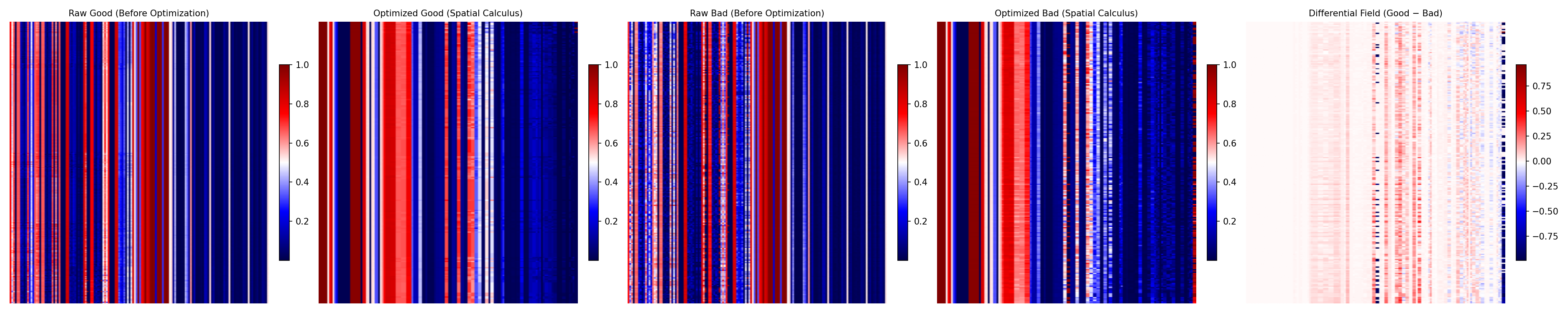 Phōs in action good vs. bad reasoning, organized and subtracted until only the real difference remains.
Right below is the quantitative view of that same process
the metrics that actually survive the light.
 The surviving metrics the dimensions that continue to shine after the noise has been erased.
Because sometimes, seeing really is believing.
🎯 The Core Idea: Compare to See
Before diving into agents or trees, let’s state the central idea plainly:
If two reasoning paths lead to different outcomes, their difference should reveal what matters most.
So we do something simple:
- Collect hundreds of “good” reasoning traces.
- Collect hundreds of “bad” ones.
- Compute average Visual Policy Maps (VPMs) for each.
- Subtract them.
- What survives? That’s likely part of how the model learns.
👉 This isn’t about consciousness.
👉 It’s about signal detection via contrast like fMRI, but for AI reasoning.
And once you have that differential map, you can:
- Rank which metrics matter most,
- Extract high-signal regions,
- Feed them back into training.
All without ever leaving the visual domain.
Now let’s build it.
🛠️ Step-by-Step: From Metrics to Light
Each section includes:
- A plain-English explanation,
- Minimal Python code,
- Expected output.
You can copy-paste this into a notebook and follow along.
Step 1 · Start with Reasoning Metrics
Every reasoning step generates signals like:
alignment_score: Does this thought match the goal?coherence_flow: Is logic smooth?q_value_step: Estimated utility of current stateenergy_total: Cognitive load / uncertainty
We collect these into a matrix one row per reasoning step.
import numpy as np

# Mock dataset: 300 samples, 4 key metrics + ID
np.random.seed(42)
n_samples = 300
metrics_data = np.column_stack([
    np.arange(n_samples),                # node_id (sortable index)
    np.random.normal(0.85, 0.05, n_samples),  # alignment
    np.random.normal(0.78, 0.10, n_samples),  # clarity
    np.random.normal(0.90, 0.03, n_samples),  # coherence
    np.random.normal(0.40, 0.15, n_samples),  # energy (higher = more confusion)
])
metric_names = ["id", "alignment", "clarity", "coherence", "energy"]
✅ We now have a synthetic trace of reasoning behavior.
Step 2 · Sort by Time (or Tree Depth)
To make a timeline, we need order usually by node_id.
def sort_by_first_column(matrix):
    return matrix[matrix[:, 0].argsort()]

metrics_sorted = sort_by_first_column(metrics_data)
Now our data flows left-to-right in chronological or tree order.
Step 3 · Normalize Across Metrics
Different scales break visuals, so we normalize.
Note: All VPMs (Good, Bad, or Mixed) must share the same global scaler. Fitting a separate scaler for each subset exaggerates differences and invalidates semantic comparison.
from sklearn.preprocessing import StandardScaler

scaler = StandardScaler()
scaler.fit(metrics_sorted[:, 1:])          # fit on all data (skip ID)
metrics_scaled = scaler.transform(metrics_sorted[:, 1:])
Now all metrics live on a consistent scale ready for imaging.
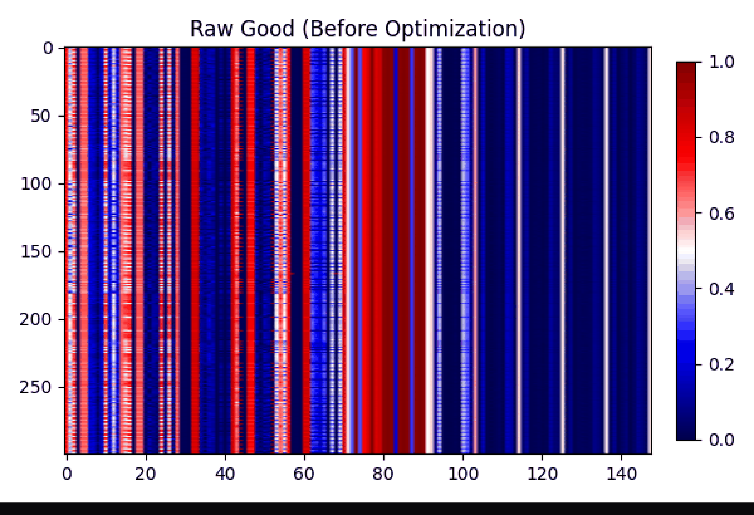
Step 4 · Turn into a Visual Policy Map (VPM)
Each row becomes a horizontal band of color. Each column = one metric. Color intensity = normalized value.
import matplotlib.pyplot as plt

vpm_image = metrics_scaled.T  # Shape: (C, H) → easier to visualize

plt.figure(figsize=(10, 3))
plt.imshow(vpm_image, aspect='auto', cmap='viridis')
plt.colorbar(label='Normalized metric intensity (z-score)')
plt.xlabel("Reasoning Step")
plt.ylabel("Metric Dimension")
plt.title("Visual Policy Map (VPM): A Timeline of Cognition")
plt.tight_layout()
plt.savefig("vpm_example.png", dpi=150)
plt.show()
🖼️ Output: A heatmap showing how each metric evolves during reasoning. Already, you’re watching cognition unfold.
Step 5 · Generate Two Populations (Good vs Bad)
Let’s simulate two types of runs:
# Good reasoning: high alignment, low energy
good_mask = (metrics_sorted[:, 1] > 0.8) & (metrics_sorted[:, -1] < 0.5)
good_matrix = metrics_sorted[good_mask][:100]

# Bad reasoning: low alignment, high energy
bad_mask = (metrics_sorted[:, 1] < 0.7) | (metrics_sorted[:, -1] > 0.6)
bad_matrix = metrics_sorted[bad_mask][:100]

# Scale both using the pre-fitted global scaler
good_scaled = scaler.transform(good_matrix[:, 1:])
bad_scaled  = scaler.transform(bad_matrix[:, 1:])
Now compute average VPMs:
vpm_good_avg = good_scaled.mean(axis=0)
vpm_bad_avg  = bad_scaled.mean(axis=0)
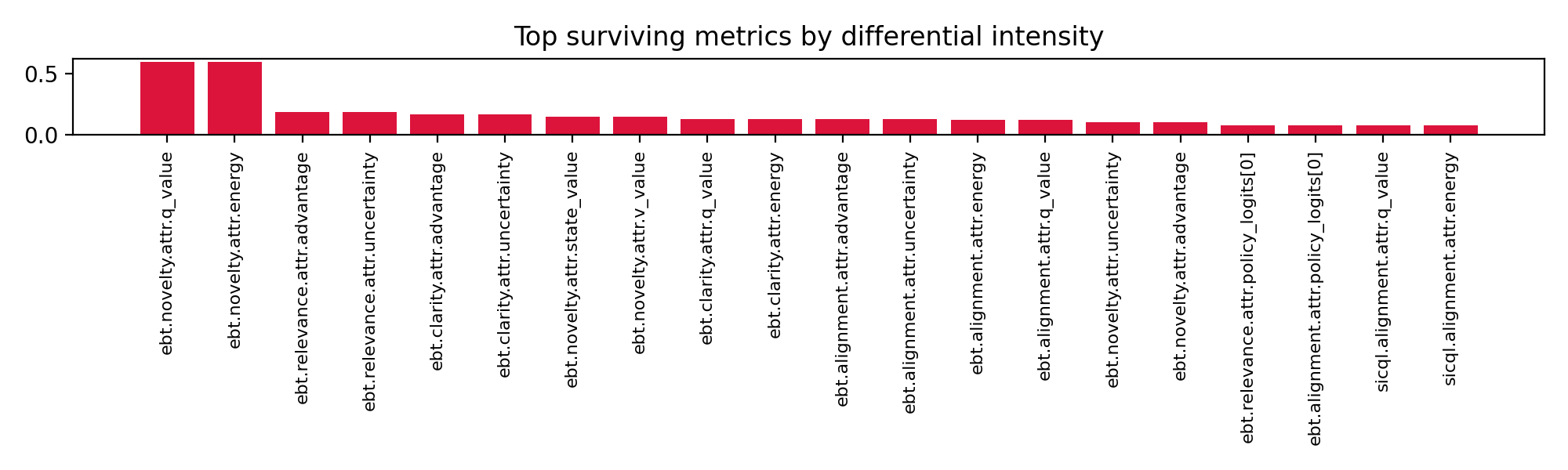
Step 6 · Compute the Epistemic Difference Field
Subtract bad from good and measure magnitude.
diff_vector = np.abs(vpm_good_avg - vpm_bad_avg)
intensity = diff_vector.flatten()

plt.figure(figsize=(8, 2))
plt.bar(range(len(intensity)), intensity, color='indianred')
plt.xticks(range(len(intensity)), metric_names[1:], rotation=45)
plt.ylabel("Differential Intensity")
plt.title("What Survives the Light?: Metrics That Define Good Reasoning")
plt.tight_layout()
plt.savefig("metric_intensity_plot.png", dpi=150)
plt.show()
📊 Result: A ranked list of which metrics most distinguish good from bad reasoning.
Top performers: alignment, coherence.
Noise: energy outliers.
These are the surviving signals the core of understanding.
Step 7 · Save with Provenance
Always embed metadata so results are auditable.
import json
from datetime import datetime

provenance = {
    "source": "mock_simulation",
    "n_good": len(good_matrix),
    "n_bad": len(bad_matrix),
    "metrics_used": metric_names[1:],
    "normalization": "StandardScaler",
    "timestamp": datetime.utcnow().isoformat() + "Z"
}

with open("epistemic_field_provenance.json", "w") as f:
    json.dump(provenance, f, indent=2)
Now anyone can verify exactly how this image was produced.
🧩 Why This Works The Real System Behind It
Now that you’ve built the core idea in <100 lines, let’s zoom out to how it fits inside Stephanie’s stack.
Where Do the Traces Come From?
In practice, we use the Agentic Tree Search (ATS) a recursive system that explores variations of prompts and responses.
Each branch is scored using our evaluation stack (MRQ · SICQL · EBT · HRM), producing rich metric vectors.
We group outputs into three categories:
| Category | Meaning |
|---|---|
| 🟢 Good | High-quality, goal-aligned reasoning |
| 🟡 Mixed | Ambiguous or partially aligned |
| 🔴 Opposite | Contradictory or incoherent reasoning |
Only Good and Opposite are used for contrast maximizing signal difference.
How It Runs at Scale
Phōs integrates into Stephanie’s distributed arena:
    flowchart LR
    A[🎯 Goal] --> B[🌲 Agentic Tree Search]
    B --> C[📊 Scoring Stack<br/>MRQ · SICQL · EBT · HRM]
    C --> D[🧮 MetricsWorker<br/>Flattens to Vector]
    D --> E[🌈 VPMWorker<br/>Generates Timeline]
    E --> F[🔦 PhōsAgent<br/>Contrast: Good − Opposite]
    F --> G[📈 Epistemic Field + Report]
Workers communicate via NATS JetStream, enabling asynchronous, scalable processing.
But none of that changes the core idea:
Compare structured metric timelines. Subtract. See what remains.
Even without ATS or NATS, you can apply this method to any agentic system.
🌕 From Measurement to Illumination
In Greek, phōs (φῶς) means light the root of photo, photon, and phenomenon.
That’s what this is: turning abstract cognition into visible form.
We introduced the ZeroModel framework here: ZeroModel: Visual AI You Can Scrutinize
Phōs builds on it not to replace numbers, but to complement them with vision.
Because humans are visual creatures. We notice patterns faster than statistics.
And now, so can our models.
💡 What This Enables
Once you can see reasoning, you can use it.
Phōs turns every reasoning step into measurable structure and that structure can guide learning directly.
How?
- Detect drift: Compare today’s epistemic field to yesterday’s. If the pattern shifts, reasoning has changed.
- Diagnose failure: Dark, unstable regions mark confusion or inconsistency.
- Reinforce understanding: Bright, stable regions signal coherent reasoning feed them back into training.
- Train from light: Reward the model when its reasoning map resembles a known good field.
It’s not magic. It’s feedback visual, continuous, self-correcting.
Phōs turns what used to be invisible (the reasoning process) into something an AI can measure, compare, and improve from.
Because sometimes, seeing really is believing.
And the most remarkable part?
You can see it too.
The human eye doesn’t need a legend or a metric key to know when something’s gone wrong.
You can glance at a Phōs map and instantly feel when reasoning drifts, when clarity sharpens, or when coherence collapses.
That’s the bridge the moment when both human and machine can recognize learning at a glance.
 Gif showing the transfromation and subtraction of good and bad learning